

What is CSS Grid?
CSS grid is a two-dimensional layout system that is used to display your items on a page in Rows and Columns.
CSS grid is a Powerful layout system, And knowing it's capabilities will make the job easy.
it has amazing prosperities that gives you more flexibility and controllability over your items like placing them in the order you want or controlling the width of rows and columns and spanning them etc...
What is the difference between flexbox and grid?
they both are similar to some instinct, but the major different is that flex box is a one dimensional layout, and grid is a two dimensional layout.
you are free to use what you are more comfortable with.
but in some scenarios one of them does the job easier with out any confusion.
for instance, when I want to make a navbar I would prefer to use flexbox. And when I want to make cards layout, grid would be the best way to go with... and so on.
Grid Properties
Properties for the Parent
(Grid Container)
display
the display property should be applied to the container that contains the items which we want to layout.
container{
display:grid;
}
grid-template-columns
grid-template-columns is used to create a specified number of columns based on the values given.
each column will take its corresponding size value.
there are more than one way to specify the sizes of columns, as shown below:
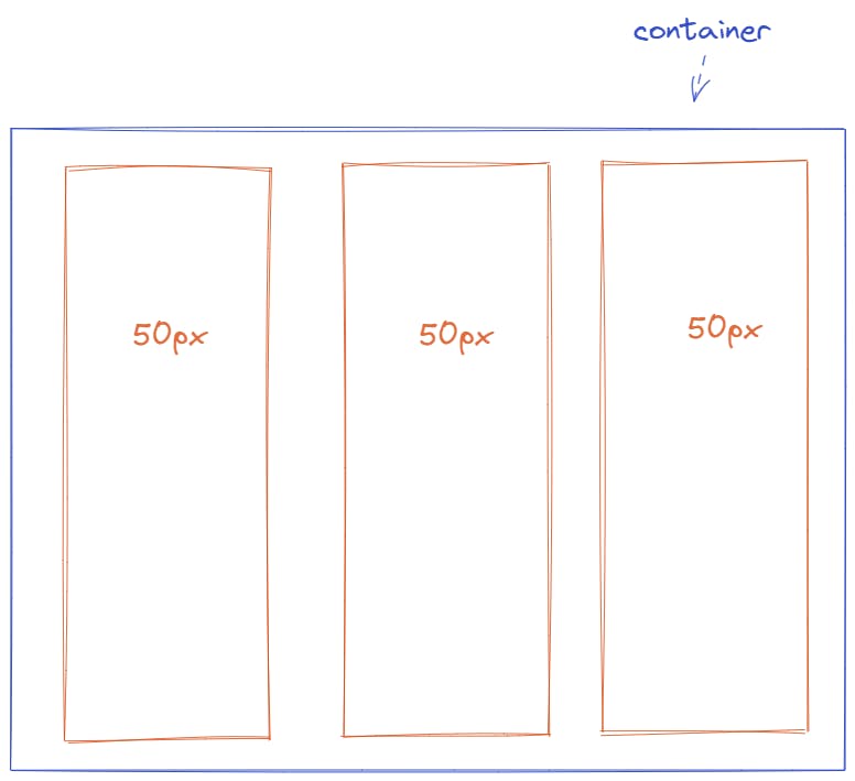
Here we can immediately give the sizes in px:
.container{
grid-template-columns: 50px 50px 50px; /*in this , three columns are created and their sizes are 50px each */
}
OR we can give the sizes using the unit fr:
the fr unit will give each column an equal fraction of the available width of the container .
.container{
grid-template-columns: 1fr 1fr 1fr; /*the fr unit will give each column an equal  fraction of the available width of the container */
}
OR we can give the sizes using the keyword repeat(number of columns, sizes):
.container{
grid-template-columns: repeat(3, 1fr); /*in this example 3 columns will be created and each column will get 1 fr of the available width  */
}
grid-template-rows
grid-template-rows is used to create a specified number of rows based on the values given.
each row will take its corresponding size value.
there are more than one way to specify the sizes of rows, as shown below:
Here we can immediately give the sizes in px:
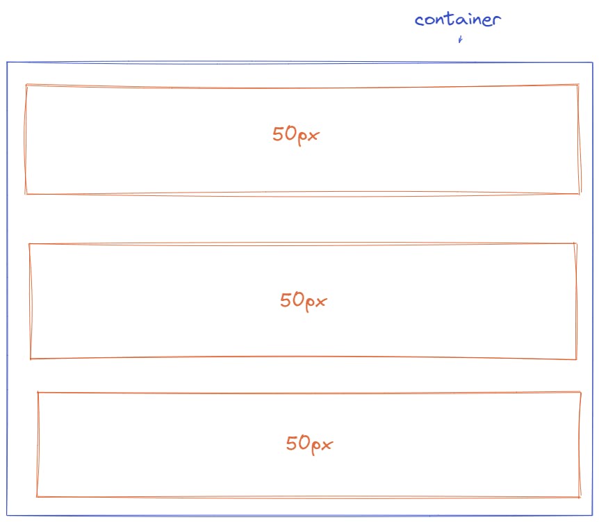
.container{
grid-template-rows: 50px 50px 50px; /*in this , three rows are created and their sizes are 50px each */
}
OR we can give the sizes using the unit fr:
the fr unit will give each row an equal fraction of the available width of the container .
.container{
grid-template-rows: 1fr 1fr 1fr; /*the fr unit will give each rows an equal  fraction of the available width of the container */
}
OR we can give the sizes using the keyword repeat(number of rows, sizes):
.container{
grid-template-rows: repeat(3, 1fr); /*in this example 3 rows will be created and each row will get 1 fr of the available width  */
}
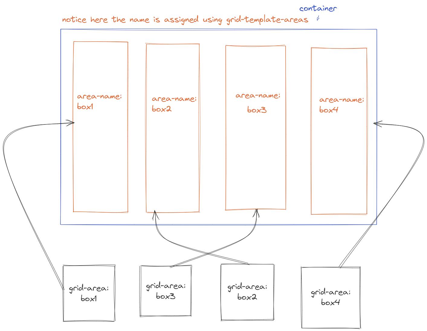
grid-template-areas
This is one of the most interesting prosperities of grid, It allows you to assign each column or row with a specified HTML element. By using the grid area we assign the HTML element with a name and we give this name inside the grid-template-areas properity, ...confusing right? , check out the below example to understand .
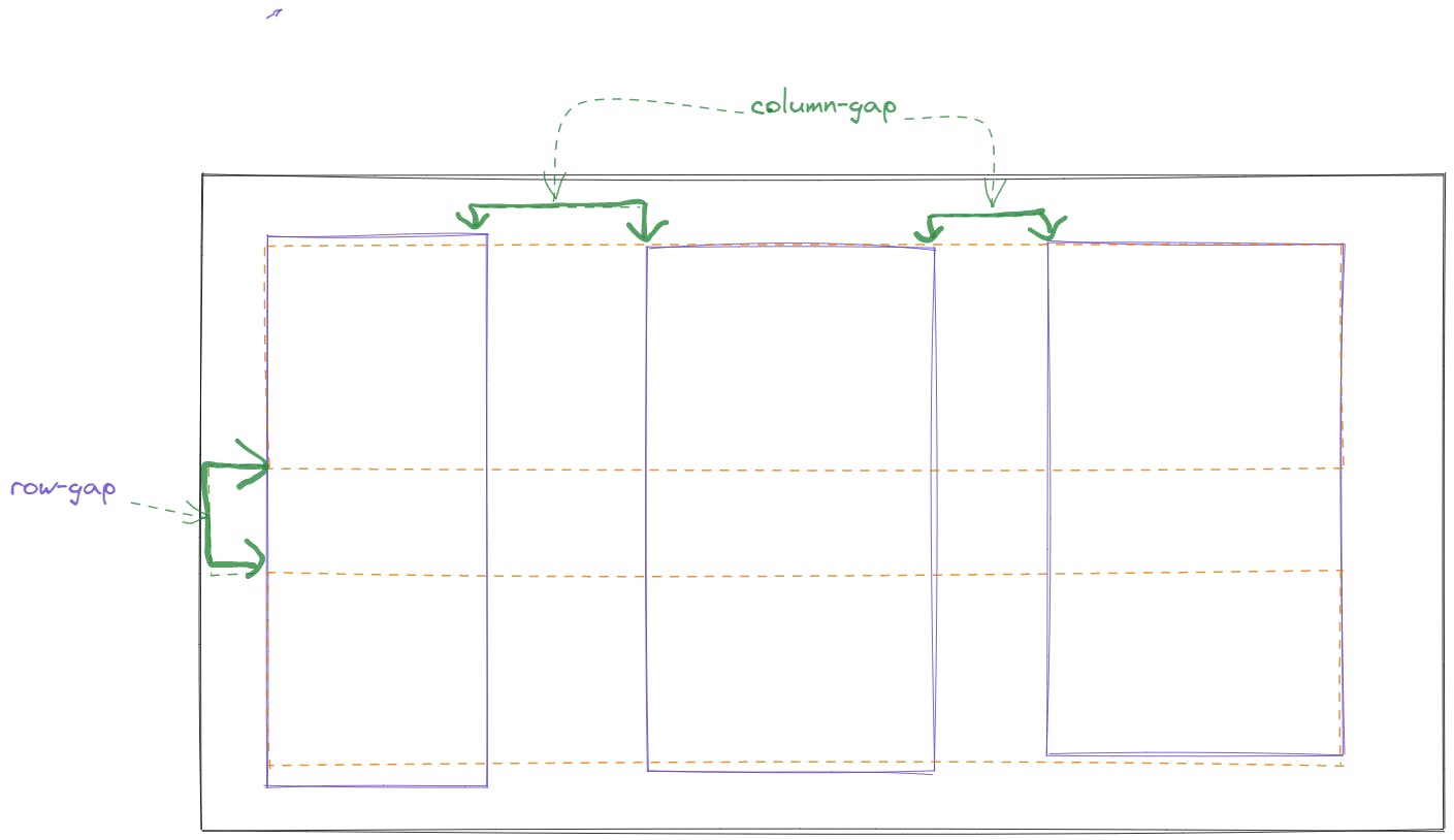
column-gap / row-gap
it is used to create a gap between the rows/columns. as simple as it saound.
Example:
align-items
this will align the items along the Block (column) axis. This value applies to all grid items inside the container.
.container {
  align-items: start | end | center | stretch;
}
justify-content
this will align the items along the Block (row) axis. This value applies to all grid items inside the container.
.container {
  justify-content: start | end | center | stretch | space-around | space-between | space-evenly;
}
Properties for the Children
(Grid Items)
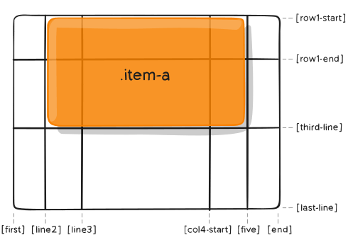
grid-column-start & grid-column-end
this helps you to set the starting and ending point of an element like from which column to which.
Example:
.item-a {
  grid-column-start: 2;
  grid-column-end: five;
  grid-row-start: row1-start;
  grid-row-end: 3;
}
grid-row-start / grid-row-end
this helps you to set the starting and ending point of an element like from which row to which.
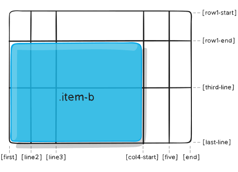
Example:
.item-b {
  grid-column-start: 1;
  grid-column-end: span col4-start;
  grid-row-start: 2;
  grid-row-end: span 2;
}