
CSS Flex Box - The BEST Way To Design Your Layout
This article will drive you through how to use flex box and its properties with clear examples that are designed in a way that makes it a cub of tea


what is CSS Flexbox?
CSS is a one-dimensional layout method that helps you to arrange the items in Rows or Columns. Through Flex Box you can control and change the position of items with less line of code. it gives you more control on the items in the sense of positioning those items or re-arranging their order, or giving them equal spacing ...etc.
Why Flexbox?
Flex Box is the best, easiest way to design your layout as it gives you more controllability on the items, and its very easy to understand . Were methods like Float and Positioning does the same job But in some ways they're also limiting and frustrating and also can be so much confusing.
Flexbox , makes it easier to design flexible responsive layout structure without using float or positioning.
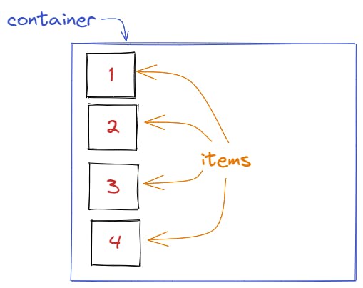
Flexbox properties
Properties for the Parent
(flex container)
display
this is used to define our method of display like flex,inline or block and the items will be displayed based upon the gives value.
To apply our flexbox method we define display as flex for the container that contains the items.
syntax:
.container{
display:flex;
}
Before using display: flex:
The items are displayed vertically by default.
After using display: flex:
The items are displayed horizontally side by side as shown below
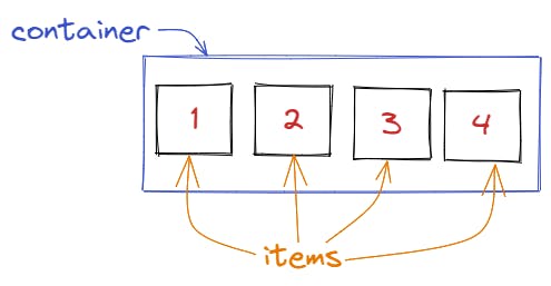
Example:
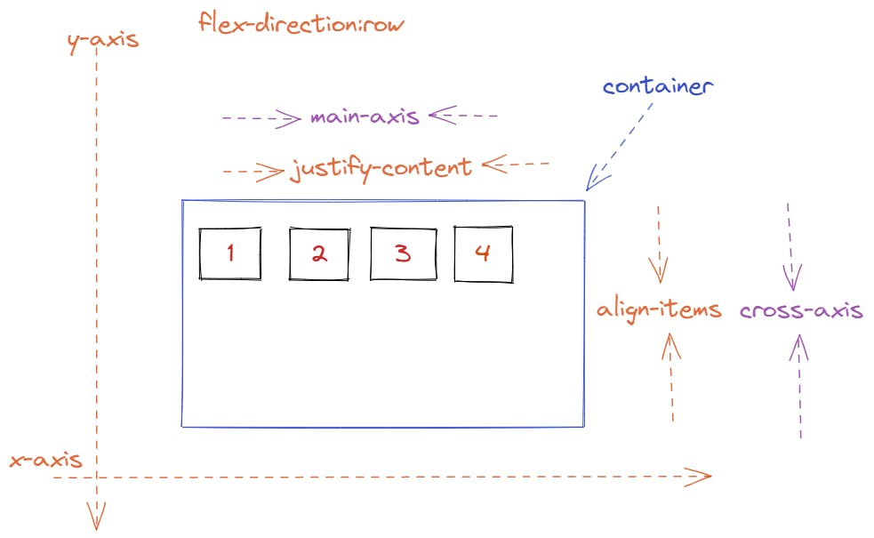
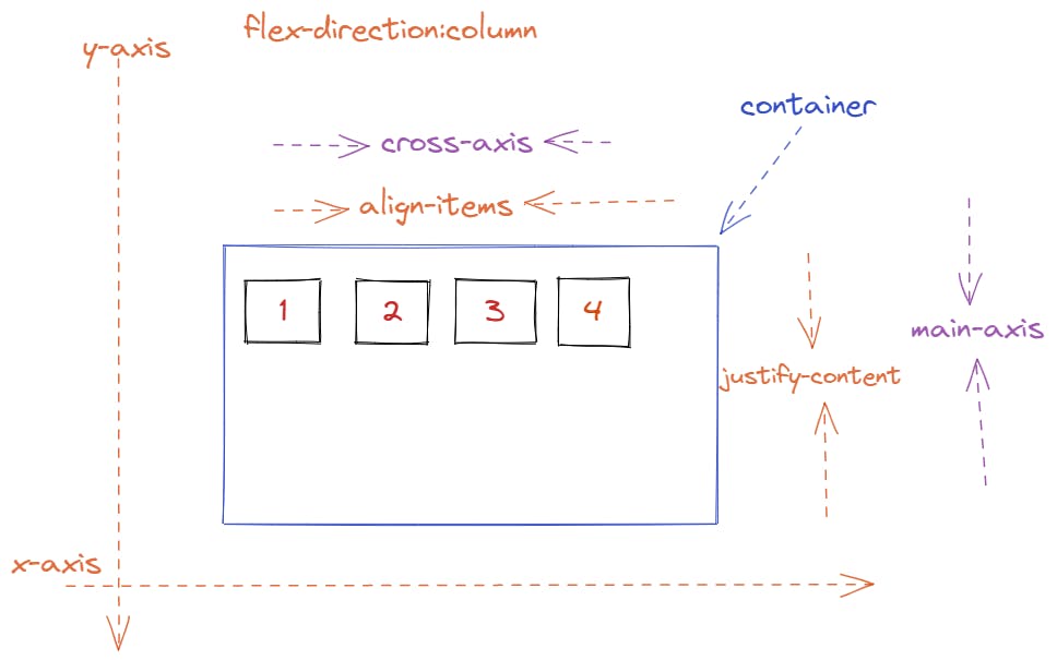
flex-direction
this is used to set the direction of the items like row, row-reverse, column, column-reverse.
when we display items as flex, by default the flex-direction is row.
.container {
  flex-direction: row | row-reverse | column | column-reverse;
}
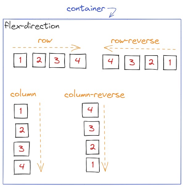
Example
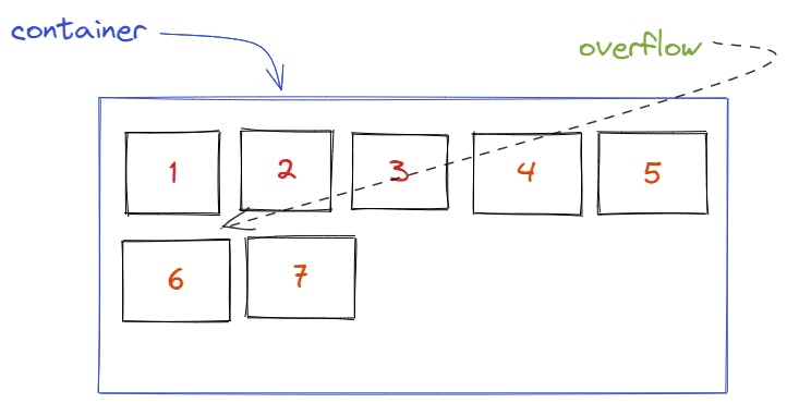
flex-wrap
By default items will try to fit in the container in one line or row side by side by reducing its width equally to make them all fit in one row.
But what if we want the items to have a specific width and if there is an overflow we want the items to go to the next row automatically ?
overflow means : if the items flows out of it's container.
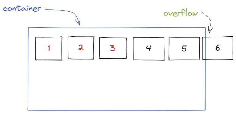
for this we use flex-wrap: wrap;, it help us to maintain the width of our items by placing the overflow items to the next line.
.container {
  flex-wrap: nowwrap | wrap | wrap-reverse;
}
- Example:*
justify-content
This defines the alignment of the items along the main axis.
.container {
  justify-content: flex-start | flex-end | center | space-between | space-around | space-evenly | start | end
}
flex-start (default): items are packed toward the start of the flex-direction.
flex-end: items are packed toward the end of the flex-direction.
start: items are packed toward the start of the writing-mode direction.
end: items are packed toward the end of the writing-mode direction.
center: items are centered along the line
space-between: items are evenly distributed in the line; first item is on the start line, last item on the end line
space-around: items are evenly distributed in the line with equal space around them
space-evenly: items are distributed so that the spacing between any two items (and the space to the edges) is equal.
first lets understand what is the main axis and what is the cross axis:
the main axis is the direction of the flex-direction like if the direction is row then the main axis will be from left to right on the x-axis and the cross axis is from top to bottom on the y-axis and vice versa, as shown below:
when the flex direction is row
when the flex direction is column
Example to show case justify content values
align-items
is used to align flexed items on the cross axis.
.container {
  align-items: stretch | flex-start | flex-end | center | baseline | first baseline | last baseline | start | end ;
}
i have explained with a drawing how to identify the main and the cross axis on justify-content so refer that.
%[codepen.io/salehedhah/pen/poKpWPJ]
gap
this is used to create a gap between the items or between rows or columns.
its an easy,fancy way to create space between the items instead of margin.
.container {
  display: flex;
  ...
  gap: 10px;
  gap: 10px 20px; /* row-gap column gap */
  row-gap: 10px;
  column-gap: 20px;
}
Example
Properties for the Children
(flex items)
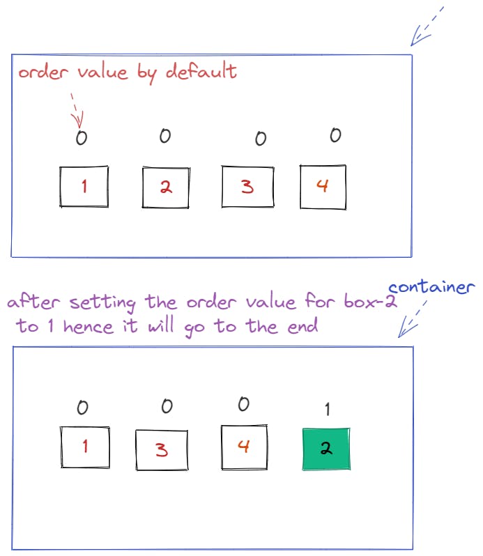
order
The order property is designed to lay the items out in ordinal groups.
By default the flexed item's order is 0, so when you set the order value for a flexed item with an integer value > 0, this item will be put after the items with the default order value (0), and the opposite is applied when the value is negative value (-) .
Example
align-self
This allows the default alignment to be overridden for individual flex items.
.item {
  align-self: auto | flex-start | flex-end | center | baseline | stretch;
}
Example: